Swit interface overview
Swit's interface is divided into five areas: core menu, main menu, main screen, top bar, and the right panel. Read more about each interface element in detail below.
Core menu
The core menu is a collection of Swit's essential features, consisting of the main navigational functionalities found in the main menu.
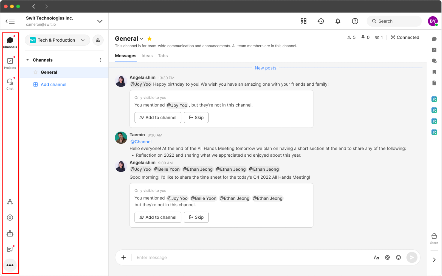
- At the top, there are channels and projects, the primary spaces for collaboration within the organization, and chat for more private communication.
- At the bottom, there are various plug-in features that can be purchased separately to enhance collaborative functionalities, such as Goals and Approvals. Additionally, there is the Members section for a quick overview of organizational members, Admin menu displayed only for organization administrators, and the Audit logs only accessible to auditors.
Main menu
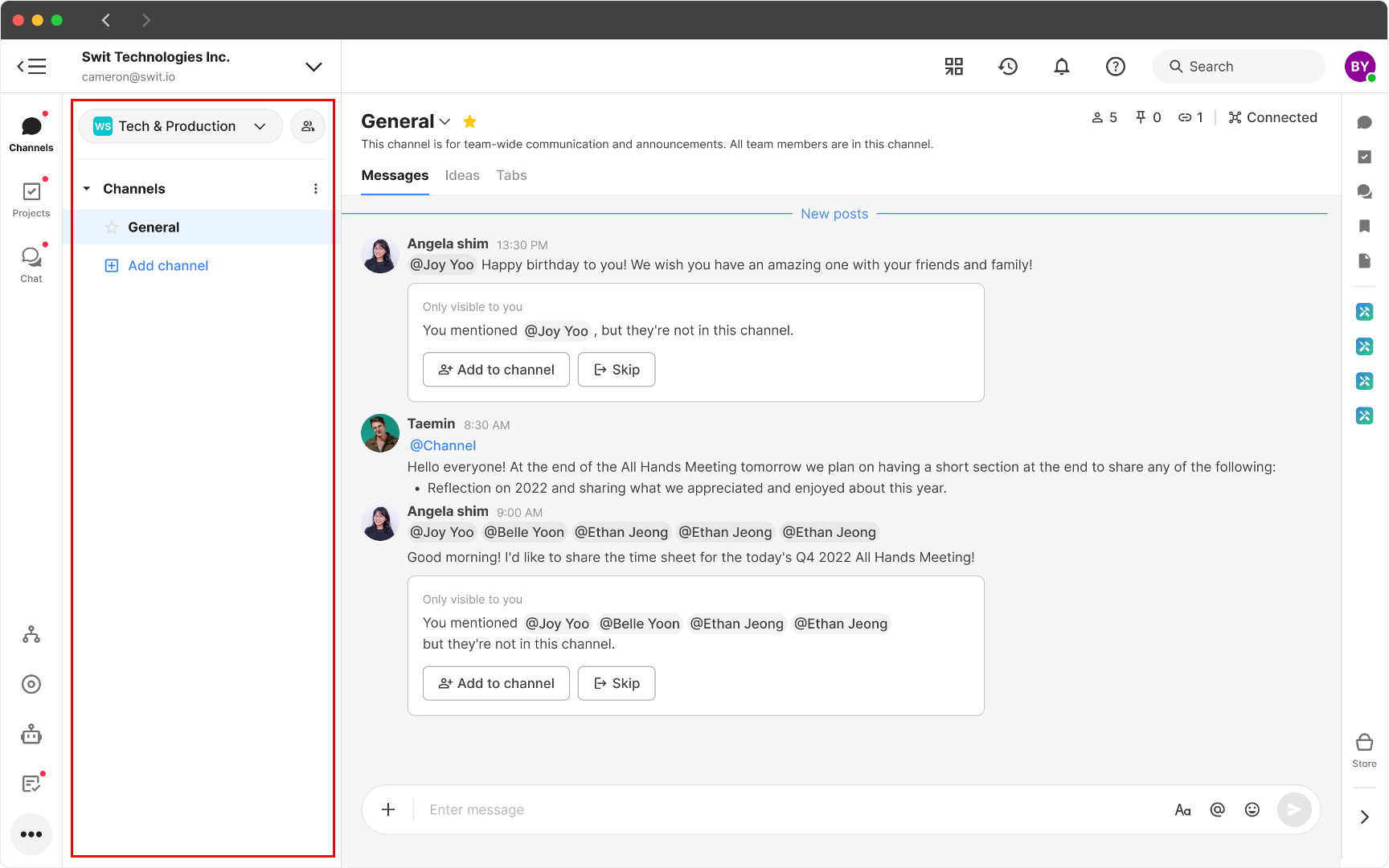
The main menu is a space with navigational features, which can be expanded or collapsed. The composition of the main menu changes according to the core menu, being centered around the top core menu.
Main screen
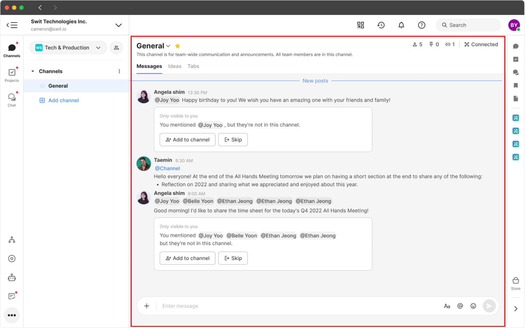
When an item is selected from the core menu, a space where one can utilize the corresponding feature appears, known as the main screen. For example, when a channel is clicked, a screen opens with messages, ideas, and accessible tabs.
Top bar
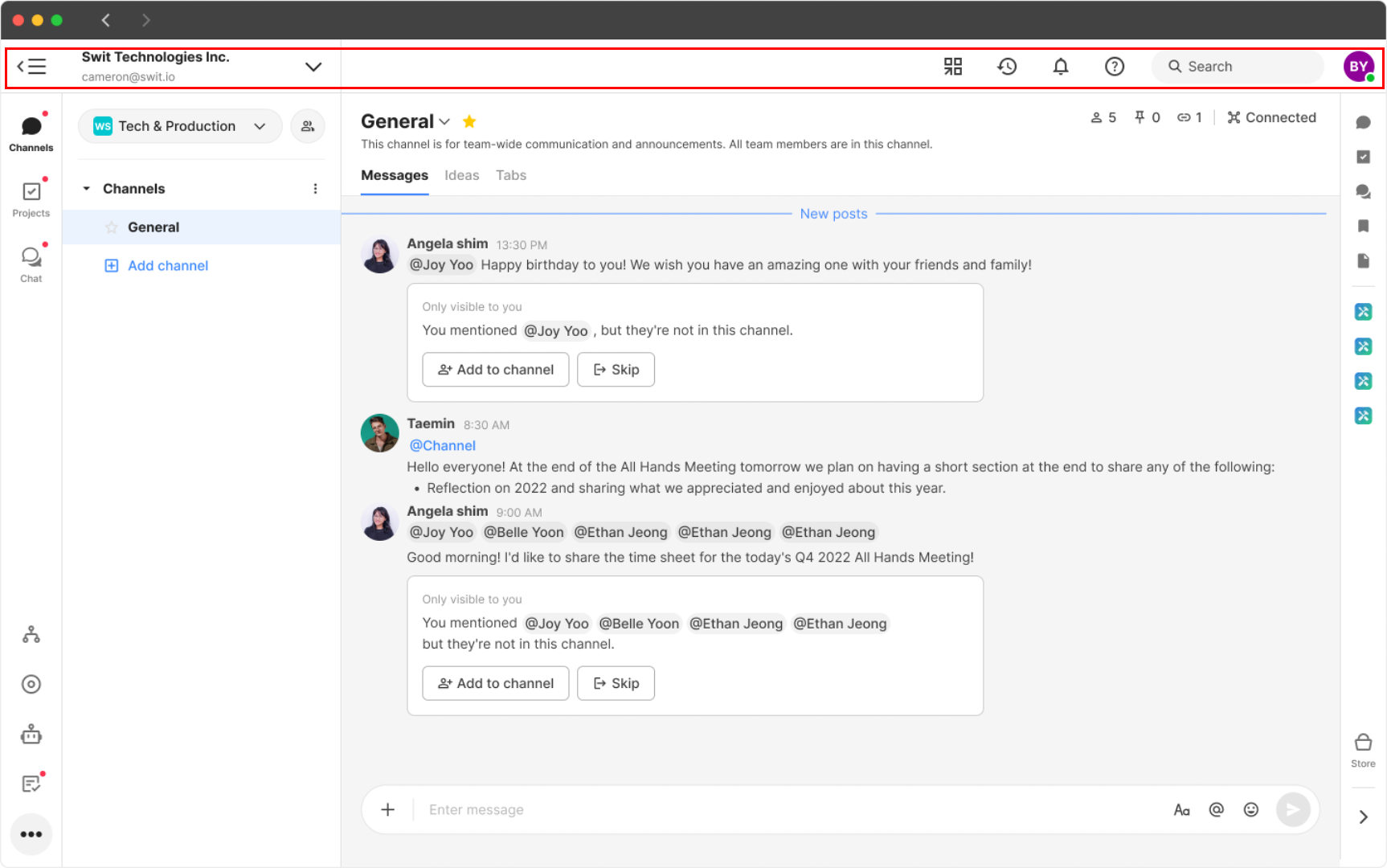
The top bar contains Shortcuts, Recent, Notifications, Search, Help, and a personalized profile menu.
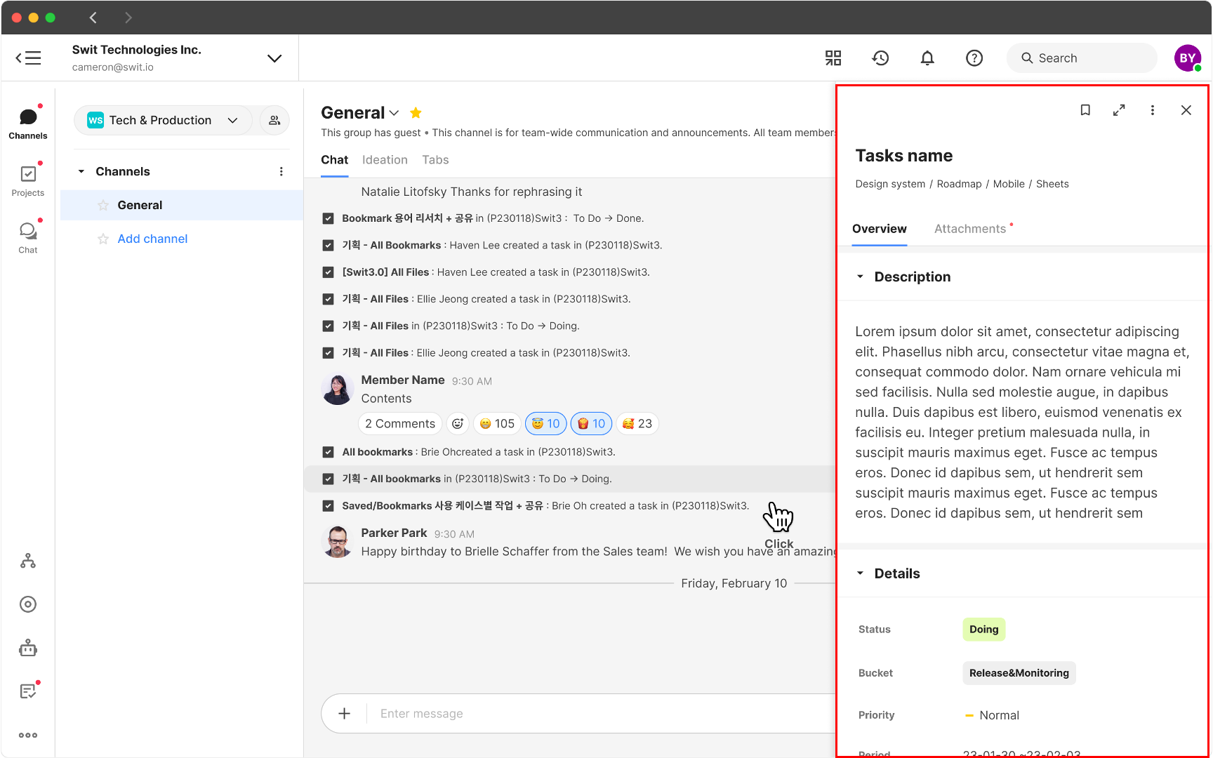
Right panel
With the right panel, you can simultaneously handle communication and task management in real-time or manage collaboration occurring in other spaces. Not only can you maintain the context of real-time tasks being conducted in channels and projects, but you can also experience extended usability by integrating various Store apps.
TIP
Experience the unparalleled collaborative scalability unique to Swit through the diverse drag-and-drop functionalities available in the right panel. Detailed use cases of various drag-and-drop features are covered in the Quick start guide.